I made a little mock-up for my tea site a few weeks ago
and finally sat down to make it. But of course in the time between then and now, my ideas
and design taste changed, and I was thoroughly motivated to learn about how to use options like
float, display: inline-block;, and most of all, box-sizing: border-box.
The site's HTML and CSS is here, see
the site for yourself here.
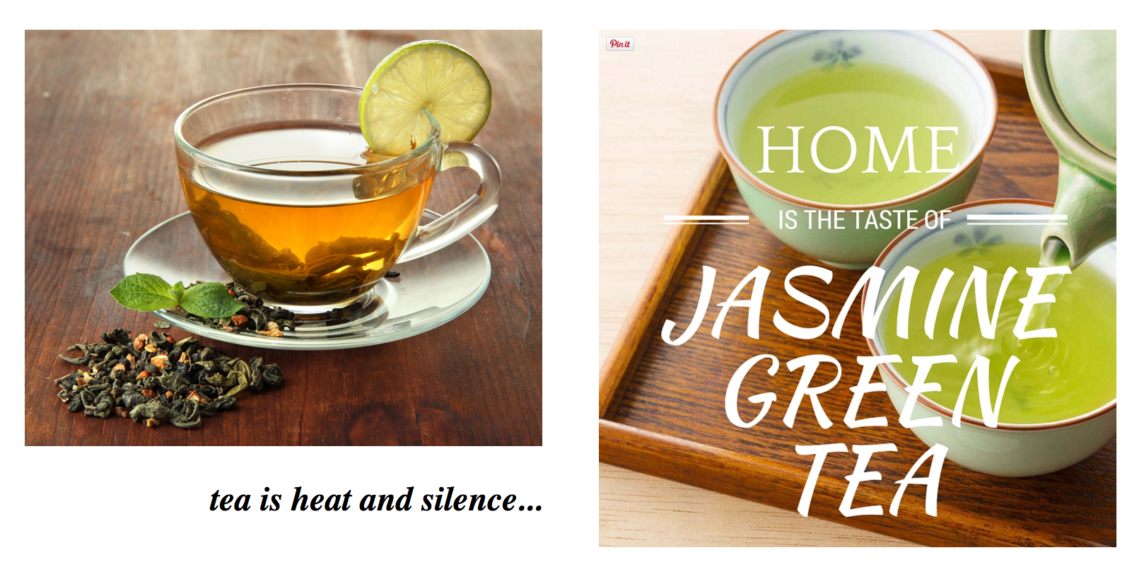
Somewhere in the depths of the night, in a sugar-fueled haze, I decided I wanted pretty images to grace my page, and floating images just by themselves, altering with text, wasn't at all the effect I wanted. So I found Canva, a site that lets you mix text, images. and shapes to make nice pleasing visual elements that look completely at home on someone's Facebook feed. Here's my favorite one that I made:
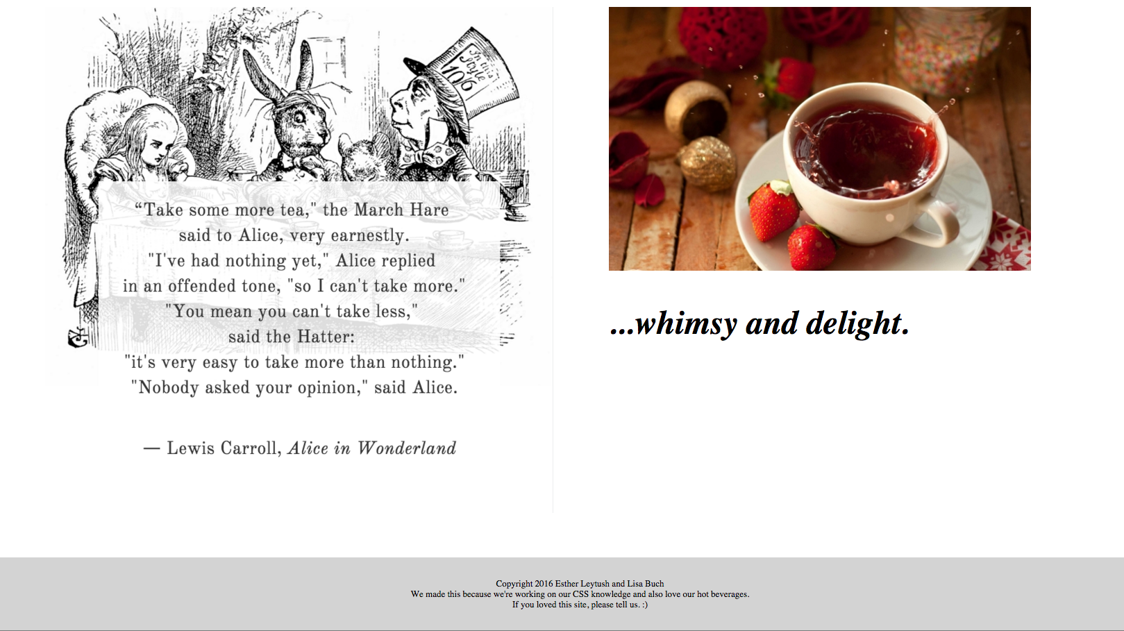
Quite right, Alice.
(On a nerdy note, I chose that quote because it read like an array joke.)
The top and bottom of the page gave me a chance to work on headers and footers that stick to the top and bottom respectively and stretch the full width of the page. I think the footer turned out to be my favorite element:
The site isn't responsive, the items are really gigantic on my screen and take up a lot of space generally, and the whole experience of it doesn't feel cohesive, but it was a great, really great learning experience. I learned about making the navbar in a way that has the floating right element positioned inside the rest of the floating left elements, which was really not at all intuitive. I learned about visual design, a topic I really can't say I have much fondness for. I learned more than I think I could stomach about floating elements and trying to make them align.
The next step would be to learn about JavaScript and embedding some nice code to have that test work.